Color is the silent storyteller of your home—it sets moods, defines personalities, and turns rooms into experiences. But with endless hues and combinations, how do you pick the perfect palette? Whether you’re redecorating a cozy studio or refreshing a family-friendly living room, this guide breaks down the art of selecting color schemes that feel cohesive, intentional, and uniquely you. Let’s dive into the principles, psychology, and practical tips to make your space shine.
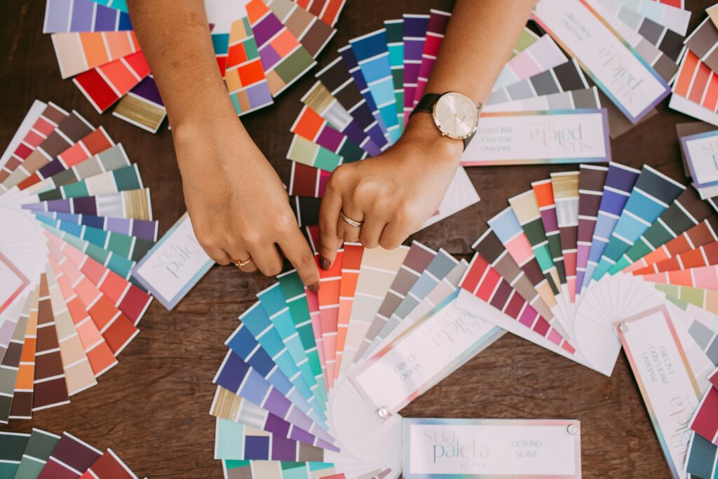
Understanding the Basics of Color Theory
Before swatching paint or ordering throw pillows, revisit the fundamentals:
- The Color Wheel: Primary (red, blue, yellow), secondary (orange, green, purple), and tertiary colors (mixes like red-orange) form the foundation.
- Warm vs. Cool Tones: Warm shades (reds, yellows) energize; cool tones (blues, greens) soothe. Balance them based on room purpose.
- Complementary and Analogous Schemes: Pair opposites (blue and orange) for drama or neighbors (green and teal) for harmony.
For a deeper dive into pairing colors with decor, explore our guide to mixing throw pillows and wall art.
Start with the Room’s Purpose
Ask: What do you want this space to feel like?
- Living Rooms: Warm neutrals (taupe, warm gray) encourage conversation, while bold accents (terracotta, navy) add vibrancy.
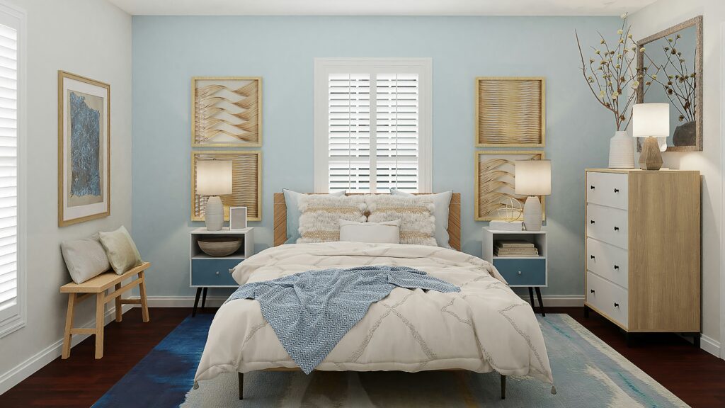
- Bedrooms: Soft blues, greens, or lavender promote relaxation—ideal for unwinding.
- Home Offices: Energizing yellows or muted greens boost focus without overwhelming.
Interior designers at Apartment Therapy often recommend aligning colors with a room’s “energy goals.”
The 60-30-10 Rule: Your Secret Weapon
This timeless formula creates balance:
- 60% Dominant Color: Walls, large furniture (e.g., a beige sofa or soft gray walls).
- 30% Secondary Color: Curtains, rugs, or accent chairs (e.g., sage green drapes).
- 10% Accent Color: Throw pillows, art, or decor (e.g., mustard yellow vases).
For small spaces, tweak the ratio—lighter dominant shades make rooms feel airier. Our tips on maximizing small spaces explain how color impacts perception.
Draw Inspiration from Existing Elements
Already have a rug, artwork, or heirloom piece you love? Let it guide you:
- Pull from Patterns: A floral rug might inspire blush pink walls and emerald accents.
- Match Undertones: If your sofa has warm brown undertones, avoid clashing with cool gray walls.
- Nature’s Palette: Earthy greens, sandy neutrals, and sky blues create organic calm.
The Psychology of Color: How Hues Shape Mood
Colors whisper to our emotions:
- Blues: Trust, calmness—perfect for bedrooms or reading nooks.
- Reds: Passion, energy—use sparingly in dining rooms or entryways.
- Greens: Renewal, balance—ideal for kitchens or home offices.
- Yellows: Optimism—brighten dim hallways or sun-deprived rooms.
Studies from Verywell Mind highlight how warm tones can even stimulate appetite—a reason many restaurants use red accents.
Experiment with Popular Color Schemes

Not sure where to start? Try these crowd-pleasers:
- Monochromatic Elegance: Shades of one color (e.g., ivory to charcoal) for a sophisticated, unified look.
- Earth Tones: Terracotta, olive, and ochre—nature’s favorites for a grounded vibe.
- Jewel Tones: Sapphire, emerald, and amethyst add drama to neutral backdrops.
- Scandinavian Minimalism: White walls with black accents and wood tones for crisp simplicity.
For eclectic ideas, our bohemian decor tips showcase bold, layered palettes.
Test Before You Commit: Swatches, Samples, and Apps
Avoid costly regrets:
- Paint Swatches: Test on walls at different times of day—natural light changes everything.
- Digital Tools: Apps like Coolors or Adobe Color generate palettes from photos of your space.
- Fabric Samples: Drape throw pillow covers or curtains temporarily to see how colors interact.

Common Mistakes (and How to Avoid Them)
- Ignoring Lighting: North-facing rooms need warm hues to counter gray light; south-facing spaces can handle cooler tones.
- Overmatching: Your couch doesn’t need to exactly match the wall color—complement instead.
- Forgetting Flow: Ensure adjacent rooms share at least one common color for cohesion.
DIY Fixes for Color Regrets
Already painted yourself into a corner? Try:
- Accent Walls: Tone down a too-bold room with a single neutral wall.
- Layer Textiles: Drape neutral blankets or rugs to soften overwhelming hues.
- Add Metallics: Gold or silver decor reflects light and distracts from jarring colors.
Conclusion: Your Home, Your Canvas
Choosing a color palette isn’t about following trends—it’s about crafting a space that feels authentically yours. Start small, trust your instincts, and remember: paint can be changed, pillows swapped, and art rearranged. Ready to transform your home? Explore our curated wall art collection and versatile throw pillows to bring your vision to life.
Further Learning
- Understand the science behind color emotions with this color psychology guide.
- Discover trending palettes in Pantone’s annual Color of the Year report.
CTA
Tag @LOBSBlog in your decor photos—we’d love to see how you’ve brought color into your space!